Austin unveils $1M logo redesign, congressman blasts woke rebrand as Cracker Barrel-style flop
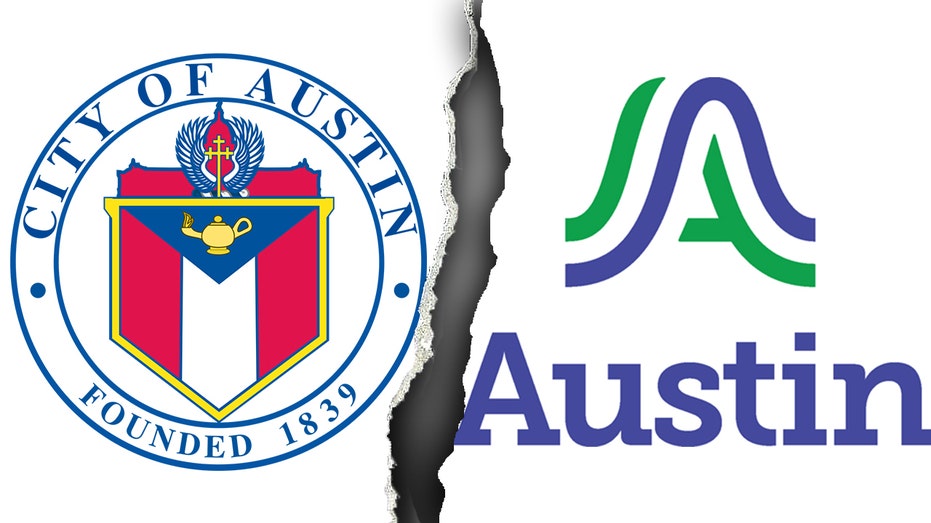
On Sept. 4, Austin officials unveiled the citys first-ever unified brand logo as part of a $1.1 million rebranding project, but the new wavy blue and green "A" has already sparked backlash from residents and critics who compared it to a math textbook publishers logo.Rep. Chip Roy, R-Tex., blasted the project during an appearance on The Will Cain Show saying city leaders "want to go spend a million dollars on a rebrand, get rid of a cross and make it some sort of, you know, a woke-looking band emblem."He accused the Texas city officials of prioritizing symbolism over safety. "We have people in Austin who dont get their 911 calls answered. You have people that have seen an increase in crime in Austin because they were going after, gutting and cutting the police force."The rebrand dates back to 2018, when the City Council voted to establish a "consistent and clear brand" across city departments. Austin currently uses more than 300 different logos, according to a City of Austin press release.DUNKIN DONUTS AND DINOSAURS: THE WILDEST CROWDSOURCED IDEAS TO REPLACE MASSACHUSETTS STATE FLAGCity Manager T.C. Broadnax defended the initiative. "For the first time in Austins history, we will have a logo to represent the city services and unify us as one organization, one Austin."The rollout begins Oct. 1, 2025, starting with digital assets like the citys website, social media and newsletters. Physical assets such as uniforms, vehicles and signage will transition gradually "to minimize impact on the City budget," according to the release.Budget documents show the total rebrand cost at $1,117,558, including $200,000 for design, $640,000 for vendors and $115,000 for public awareness campaigns, KXAN reported.CRACKER BARREL UNVEILS NEW SIMPLIFIED LOGO: 'OUR STORY HASNT CHANGED'Jessica King, Austins Chief Communications Director, said, "The logo itself reflects the hills, rivers, and bridges that serve to connect us to one another. The colors were inspired by our surrounding environment violet crown skies and the green canopies of our parks and trails."Designer DJ Stout of Pentagram admitted the process was "the ultimate design by committee" and that "Austin is a little liberal island, politically."Residents blasted the redesign online. "The new logo sucks. It looks like a homeless tent," one told KXAN. Others called it "a bad biotechs company rebranding," while Chron notes one Instagram user simply wrote, "Bruhhhh."Some defended the look as "more minimalist" and "definitely a modernization of the old one."CLICK HERE TO GET THE FOX NEWS APPMarketing professor Chris Aarons offered perspective to KXAN. "The Coca Cola was just a script, but its a beautiful script. But over 120 years, they made it mean happiness. It is really what the entity makes that logo mean at the end of the day."The City of Austin and Pentagram Austin did not immediately respond to Fox News Digital's request for comment.


 Romaian